

Choosing Fonts for Your Book Design
- Michelle M. White

- Jan 8
- 8 min read
Updated: Mar 8

Choosing fonts can feel deceptively simple. After all, you’re just picking letters, right?
In reality, typography is one of the most powerful design tools in your book. Thoughtful font choices quietly support readability, tone, and professionalism, while less intentional ones can distract readers or subtly work against your content without you ever realizing why.
Whether you’re self-publishing your first book or learning to see design choices more clearly, understanding how fonts work and how designers approach them can help the process feel more approachable and far less overwhelming.
In this article, we’ll explore the fundamentals of choosing fonts for your book design, with a focus on clarity, intention, and long-term readability, so your design decisions feel steadier, more informed, and easier to navigate.
Understanding Basic Font Anatomy
Before you start pairing or selecting fonts, it helps to become familiar with a few basic terms designers use when talking about typography. You don’t need to memorize these or use them fluently. The goal is simply to recognize what designers are referring to and to better understand why certain fonts feel easier to read than others.
Serifs and Sans-Serifs
Serif fonts have small strokes, often called “feet” or “tails,” at the ends of letters, while sans-serif fonts do not. Serif fonts are commonly associated with tradition, formality, and long-form reading, which is why they’re often used in books with a more classic or literary feel. Sans-serif fonts, on the other hand, tend to feel cleaner and more modern, and are frequently used when a lighter or more contemporary tone is desired.

Ascenders and Descenders
Ascenders are the parts of letters that extend above the main body of the text (like the top of an “h”), while descenders drop below the baseline (like the tail of a “g” or “p”). These features influence how airy or compact a block of text feels on the page.
X-height and Width
X-height refers to the height of lowercase letters, and it plays an important role in readability. Fonts with a larger x-height often feel more open and easier to read, especially at smaller sizes or in longer passages of text. Letter width also affects how much space text takes up and how dense a paragraph appears.
These details may seem subtle at first, but together they have a significant impact on how comfortable your text feels to read over many pages and on how effortlessly your reader moves through your book.
Font Pairing: Balance, Not Decoration
Font pairing is less about finding two “pretty” fonts and more about creating a sense of balance and harmony on the page. When fonts work well together, they quietly support the structure of your content rather than competing for attention.
Strong pairings usually fall into one of two broad approaches:
● Matching proportions, which creates a calm, cohesive feel
● Contrasting proportions, which helps establish clear hierarchy and visual interest

Neither approach is inherently better than the other. What matters most is consistency and intention. Mixing a formal serif with a casual or novelty font can unintentionally create tension, while pairing two fonts that are very similar can feel accidental rather than purposeful.
A thoughtful pairing helps guide readers naturally from headings to body text, making the layout feel organized and easy to follow without calling attention to the fonts themselves.
Size, Line Length, and Why Fonts Behave Differently
Font size isn’t as straightforward as it sounds, and that’s something even experienced designers account for as part of the process. Two fonts set to the same point size can look surprisingly different once they’re placed on the page.
This happens for a few reasons:
● Fonts are measured from the top of the ascender to the bottom of the descender
● Stroke thickness and letter width vary from font to font
● Some fonts naturally take up more horizontal space than others
Because of these differences, designers don’t rely on numbers alone. Instead, they look at how the text feels when it’s read. For body text, a line length of about 65–72 characters is often used as a comfortable guideline, helping reduce eye fatigue and support a smooth reading flow.
This is why professional designers always test fonts in context, setting them into actual pages, rather than choosing them in isolation. Seeing the text in place makes it much easier to judge what truly works.
Do You Have All the Variations You Need?
A font may look beautiful at first glance, but it also needs to work reliably throughout your entire book. This isn’t about limiting creativity; instead, it’s about making sure the font can support all the ways your text will be used.
Before committing to a font, it helps to check whether you need it to include:
● Italics and bold weights
● Multiple weights (such as light, regular, and semi-bold)
● Proper small caps and glyphs
● Diacritics for non-English characters (like é or ñ), which are essential for many names and words
These details matter most in longer manuscripts, where consistency and flexibility help the design stay polished from start to finish. Display fonts, in particular, often lack full character sets or well-refined spacing, which can lead to unexpected issues later in production.
Taking a moment to confirm these variations up front can save time, revisions, and frustration down the line. And it helps ensure your book is set up for success from the beginning.
Numerals Matter More Than You Think
Not all numbers are designed the same way, and this is one of those details readers rarely notice but designers pay close attention to.
● Old-style numerals vary in height and position, allowing them to blend naturally into running text. They’re often associated with a more traditional or literary feel and can make paragraphs with numbers feel smoother and more balanced.
● Lining numerals sit evenly on the baseline and align neatly with capital letters. They tend to feel cleaner and more modern, and they’re often easier to read in tables, references, and numbered lists.
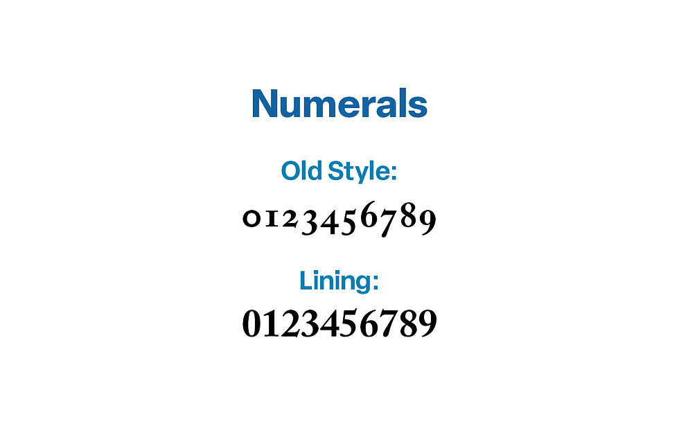
Depending on your genre, layout, and how often numbers appear, one style may support your book better than the other. This is especially true in nonfiction, academic work, or any book that relies heavily on lists, dates, or data.
Like many typographic choices, there isn’t a single “correct” option, just thoughtful ones that support readability and tone.
Punctuation, Spacing, and the Small Details
Typography often lives in the small details readers don’t consciously notice. But those details play an important role in how comfortable a page feels to read.
Designers look closely at elements such as:
● Ampersand shapes
● Apostrophes and quotation marks
● Commas and periods
● The length and spacing of em-dashes
These details affect the rhythm of the text. When punctuation is poorly designed or spacing between letters is uneven, the flow of reading can feel slightly off, even if readers can’t quite identify why.

Well-designed fonts handle these details cleanly and consistently, helping the text feel smooth, balanced, and easy to move through, especially in longer passages of body text.
Tracking, Kerning, and Why Quality Fonts Matter
Tracking and kerning are terms designers use to describe spacing within a font. Tracking refers to the overall spacing between letters, while kerning focuses on the space between specific letter pairs. These details are built directly into a font’s design and play a subtle but important role in how smooth and readable text feels.
In well-designed, professional fonts, this spacing has been carefully considered and adjusted. Letters sit comfortably next to one another, creating an even, natural rhythm that supports long-form reading. With lower-quality or free display fonts, spacing is often less refined, which can result in awkward gaps, uneven word shapes, or text that feels cramped, especially when used across an entire book.
This doesn’t mean free fonts are always a problem, but it does explain why designers often recommend investing in professional fonts for book projects. Thoughtfully built fonts reduce friction for the reader and help your pages feel polished and cohesive without requiring extra adjustments later.
Even the best fonts often require manual kerning when used in large sizes such as the title on a book cover. A good designer will spot awkward spaces and fix them, for example decreasing the space between a capital T followed by a lower case letter.
When spacing works well, readers never notice it. They simply move through the text with ease.
Choosing Fonts for Your Book Design: Trends, Tradition, and Personal Style
I typically advise authors to lean toward traditional, time-tested fonts, especially for body text. These fonts have earned their place through decades (and often centuries) of readable design, and they tend to support long-form reading especially well. You can’t go wrong choosing a timeless font such as Garamond or Caslon for your book.
That said, for this article, I’m sharing some of my current favorites, while still keeping those classic principles in mind. My font choices change over time, and these are some I enjoy working with right now. They give a fresh modern look to my designs, but they don’t always replace the tried-and-true foundations I return to again and again.
All of the fonts listed below are available through Adobe Creative Cloud, which provides professional licensing and consistent quality, which is an important consideration for book projects.
Below are a few of my current favorites, grouped by style. These are simply examples of fonts that work well in book design and can be a helpful starting point as you explore your own options.
Current Favorites:
Serif: Novel Pro, Joanna Nova, Scotch Text
Sans-Serif: Lotus Eden, Brown Pro, Montserrat
Script: Madelinette, Gautreaux, Beloved, Parisienne
Display: Bebas Neue, Kallisto

Screen Fonts vs. Print Fonts
Fonts don’t always behave the same way on screens as they do in print, and this difference can be surprising if you’re seeing your book mostly on a monitor while working on it.
Some fonts are designed to perform well digitally, where backlighting, screen resolution, and zooming capability affect how text appears. Others are created specifically with print in mind, where ink, paper, and absorption influence clarity and consistency.
When designing a book, print performance should always take priority, even if a font looks beautiful on your screen. A font that reads comfortably in print will usually translate well across formats, while the reverse isn’t always true.
This is another reason designers test fonts in printed proofs whenever possible. Seeing the text on the page reveals details that are easy to miss on a screen and helps ensure the final book feels as good to read as it looks.
Final Thoughts on Choosing Fonts for Your Book Design
Typography isn’t about chasing trends or decorating the page. At its best, it quietly supports your content by helping your words feel clear, intentional, and comfortable to read.
The right fonts:
● Improve readability
● Reinforce tone and genre
● Help your book feel polished and professional
When fonts are chosen thoughtfully, readers don’t notice the typography at all. They simply move through the text with ease, staying focused on your message rather than the mechanics behind it.
✨ Want more guidance like this?
Subscribe to my Designing Your Story series here on LinkedIn for practical, author-friendly insights on book design and self-publishing.

Comments