

What Is a Chapter Opener in Book Design? Why It Matters for Self-Publishing Authors
- Michelle M. White

- Jul 16
- 7 min read
A chapter opener does more than introduce the next chapter. It gives the reader a visual pause, creates a sense of rhythm, and helps establish the tone of the book.
For self-publishing authors, chapter openers are also one of the places where interior book design becomes especially noticeable. A thoughtful chapter opener can make the book feel polished, intentional, and aligned with the story or message inside.
In This Article
What is a chapter opener?
Why chapter openers create a visual pause
How chapter openers help set the tone of a book
Standard formatting rules to keep in mind
Common elements used in chapter openers
Creative does not have to mean elaborate
Alignment, spacing, and balance
Be careful with typefaces
What authors should look for when reviewing proofs
Quick checklist: reviewing your chapter openers
What Is a Chapter Opener?
A chapter opener is the first page of a new chapter.
It may include only a chapter number and title, or it may include additional design elements such as a quotation, image, icon, ornament, rule line, or special typographic treatment.
But a chapter opener is not simply a decorative page. It is part of the reading experience.
When a reader turns the page and begins a new chapter, the design tells them something. It may feel dramatic, elegant, or highly structured.
Those impressions matter.
A chapter opener helps the reader move from one section of the book into the next. It gives the eye a place to rest and helps the book feel organized and intentional.
Chapter Openers Create a Visual Pause
Books need rhythm. Just as paragraph breaks and section breaks help guide the reader through the text, chapter openers create a larger pause in the reading experience.
This pause is especially important in longer books. It gives the reader a moment to reset before entering the next part of the story, argument, reflection, or lesson.
In a novel, that pause may build anticipation.
In a memoir, it may give the reader space to absorb an emotional moment.
In nonfiction, it may help organize the material and make the book feel easier to follow.
A good chapter opener does not distract from the writing. It supports it.

This reflective chapter opener uses generous white space, a centered title, and a quotation to create a pause before the chapter begins. The fonts and misty speckles carry through from the front cover design.
Chapter Openers Help Set the Tone of the Book
Chapter openers are one of the places where the tone of the book can be reinforced.
The typography, spacing, and visual details all contribute to how the page feels.
A highly decorative opener may work beautifully for one book and feel completely wrong for another. A very simple opener may feel plain in one project but elegant and appropriate in another.
This is why chapter opener design should not be chosen in isolation.
The cover design, genre, and emotional tone of the book should all help guide the interior design.
For example, a reflective memoir may call for a softer approach. A business book may need something clean and structured. A historical novel might allow for a more traditional or ornamental treatment. A contemporary nonfiction book may feel better with a simple, modern typographic style.
The best chapter openers feel like they belong to the book.
Standard Formatting Rules Still Matter
Chapter openers can be creative, but they still need to respect standard book formatting practices.
For example, a chapter opener usually should not have a running header at the top of the page. In many books, the page number is also removed from the top and may either be omitted or placed at the bottom of the page.
The chapter opening text begins lower on the page than a regular text page. This gives the page a more spacious and intentional feeling.
However, it should not begin so low that the page feels awkward or unbalanced. A good general guideline is to start the chapter opener below the top margin, but not lower than about halfway down the page.
These formatting choices may seem small, but they help the book look professionally designed.
Common Elements in a Chapter Opener
A chapter opener may include:
Chapter number
Chapter title
Subtitle or section title
Relevant quotation
Small image or icon
Typographic flourish or ornament
Horizontal or vertical rule line
Extra white space
Special type treatment
Not every chapter opener needs all of these.
In fact, using too many elements can make the page feel crowded or chaotic. Often, the strongest design is the one that uses only what the book truly needs.
If a quotation is used, the author should make sure they have permission to use it when permission is required. The same is true for any image, icon, ornament, or illustration that is not original or properly licensed.

In an informational book, a chapter opener can use a diagram or visual element to orient the reader before the text begins.
Creative Does Not Have to Mean Elaborate
One of the most important things for authors to understand is that creative does not always mean elaborate.
A chapter opener can be beautiful because it is simple.
A carefully chosen typeface, generous spacing, or a subtle line can be enough to make the page feel special.
For quieter books, especially memoirs or reflective nonfiction, restraint can be very powerful. The design may need to feel soft and unobtrusive. It should give the reader room to enter the chapter without competing with the writing.
A dramatic design is not always better.
The right design is the one that supports the book.
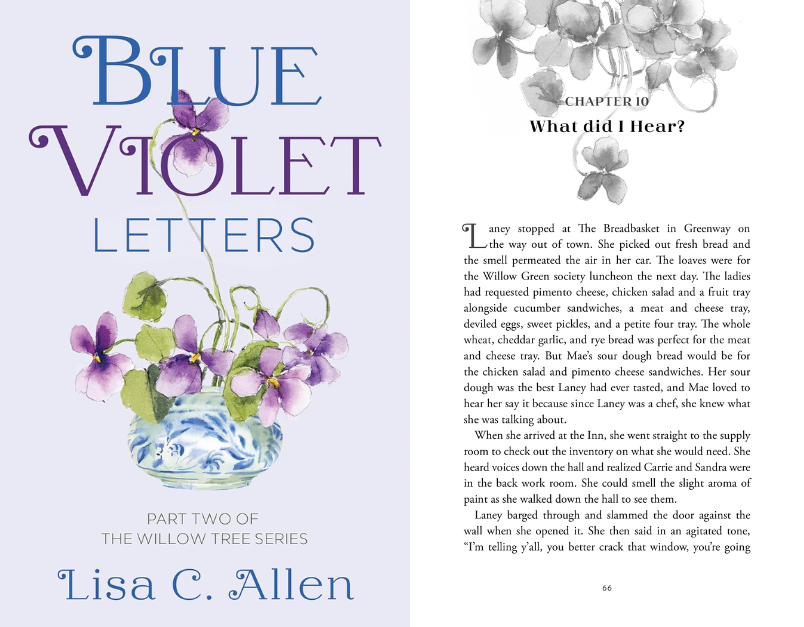
In this example, the chapter opener uses floral artwork and a centered title to create a softer, more decorative opening without overwhelming the page. The watercolor flowers are taken from the front cover design and made grayscale for the black and white interior.
Alignment, Spacing, and Balance
Alignment plays a large role in how a chapter opener feels.
A centered chapter opener often feels traditional or classic.
A left-aligned opener can feel clean and modern.
A right-aligned opener may feel a little more unexpected or edgy.
An off-center design can also work well, especially when it is balanced with an image or other visual element.
The key is that the layout should feel intentional.
Spacing matters too. The space between the chapter number, chapter title, and body text should feel consistent and proportional. The elements do not all need to be the same distance apart, but the spacing should feel visually related.
A well-designed page often has a quiet internal logic. Elements align with one another, margins feel purposeful, and white space feels balanced rather than accidental.
This is one of the reasons professional interior design matters. The reader may not consciously notice every spacing decision, but they will feel the difference between a page that is balanced and one that feels slightly off.

This chapter opener shows how alignment can change the feeling of the page. The right-aligned title creates movement while the simple layout keeps the design clean. A subtle representation of power lines is a simple touch in a book about updating the power grid.
Be Careful With Typefaces
Chapter openers can be a good place to use a more expressive typeface, but it is important not to overdo it.
As a general rule, a book interior should not use too many different typefaces. More than two or three can quickly make the design feel cluttered or inconsistent.
If a decorative or mood-setting typeface is used for chapter titles, it should still be readable and appropriate for the book.
The type choices should also work with the rest of the interior design. Chapter openers should feel connected to the body text and cover design.
The goal is not to make each chapter opener look impressive on its own. The goal is to make the whole book feel cohesive.
What Authors Should Look for in Their Proofs
When reviewing an interior proof, authors should look carefully at the chapter openers.
Ask:
Does the chapter opener feel aligned with the tone of the book?
Does it relate well to the cover design?
Does the page feel balanced?
Is there enough white space?
Is the chapter number or title easy to read?
Does the design feel consistent from chapter to chapter?
Are the same spacing rules followed throughout the book?
Are there too many fonts or decorative elements?
Does the opener support the writing without distracting from it?
If quotes or images are used, are permissions handled properly?
It can be tempting to focus only on the manuscript text when reviewing a proof, but the design deserves attention too.
Chapter openers are repeated throughout the book. If they feel uneven or disconnected from the rest of the design, the reader may not be able to name the problem, but the book may feel less professional.
Quick Checklist: Reviewing Chapter Openers
Before approving your interior design, check that your chapter openers:
Begin lower on the page than regular text pages
Do not include a running header at the top
Use page numbers appropriately, if included
Feel consistent from chapter to chapter
Match the tone of the book
Work well with the cover and interior design
Use no more than two or three typefaces overall
Have balanced spacing between elements
Use images or quotations only when they serve the book
Include proper permission or licensing for any quoted or visual material
Help the reader pause and re-enter the book
Related Reading
You may also find these helpful:
Final Thoughts
A chapter opener may seem like a small detail, but small details are part of what make a book feel complete.
The first page of each chapter gives the reader a moment to pause and begin again. When designed thoughtfully, it supports the tone of the book, creates rhythm, and helps the interior feel polished and professional.
A good chapter opener does not need to be elaborate.
It needs to feel intentional.
That idea also reflects one of the things I value most about this work: the community that surrounds each book. Behind every finished book is a team of people contributing insight, creativity, and care. I’m incredibly grateful to the authors and publishing professionals I’ve had the privilege of working with, including those featured here, and honored to play a part in helping bring their stories into the world.
Special thanks to authors and collaborators such as Lauren Johnson, Richard W. Anderson, Lisa C. Allen, Darren F. X. Clair, Kelly Himes Brolly, and Lori Finlay for trusting me with a part of your publishing journey. Each chapter opener featured here reflects a unique story, voice, and vision, and that is exactly what makes this work so meaningful to me.
Looking for more book design and self-publishing insights?
Visit me on LinkedIn, or subscribe to my Designing Your Story newsletter for practical, author-friendly guidance delivered straight to your feed.
LinkedIn: https://www.linkedin.com/in/mmwbooks/


Comments